Summer Swing

It’s summer in the USA!

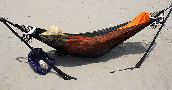
Whether you’re relaxing on the beach or just on the lawn, the Yosemite Valley Gear foldable hammock is bound to make you smile.

The steel frame is light but strong, and the nylon hammock attaches with easy-swinging hooks (touted as “high-grade Japanese bearings”) at each end.

Best of all, assembly is easy. And not “Ikea easy,” but actually simple.

If you can uncork a bottle of wine, you’ll be able to set this baby up in under 5 minutes.

This $60 accessory is perfect for carrying to the shore instead of a beach chair.

Great if you’re trapped indoors working and want to spend your lunch hour truly relaxing on your roof or deck.

Or maybe even — on late summer evenings when stomachs are full and brains are buzzing — for unexpected house guests.

h/t @toofeets, bottom photo by @phillygrrl

Blame Canada?

poor coleNo. Not really. But I am ashamed that the agency responsible for these ads is probably Philly-based.

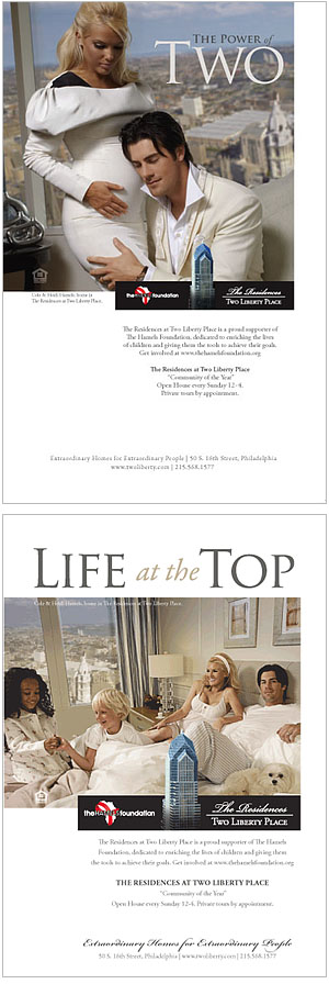
I already wrote about the odd tone of advertisements for the condos at Liberty Two (viva Lady Liberty!).

I speculated that they could do another ad with building resident and Phillies ace pitcher, Cole Hamels.

Well, they did.

As Philebrity and a ton of others noted when these came out in Philadelphia Magazine, the ads are pretty ridiculous.

Is that Cole, Elvis or KD Lang hugging the orange pregnant Heidi?

Why are random children playing in Cole’s bed?

Is this apartment in a hovercraft to obtain that angle of view out the window?

Anyway, bringing this up now because if his pitching is not up to par in today’s game 2 of the National League Division Series, I put all blame on the creative director who came up with — and subsequently approved — these ads.

Okay, and maybe Cole’s agent, too.

Update: Le sigh…

20/20 Hindsight

How many silly inventions does it take to come up with a winner?

The 20th century in the US saw a burgeoning industrial design atmosphere. From automated dishwashers and automobiles to rockets and computers, our society was fundamentally changed by these lasting engineering designs.

But quite a few others were suggested that didn’t make the cut. Looking back now, they seem silly, even absurd. But they were much more in keeping with their time.

What will our future counterparts laugh at? Segways? “Smokeless” cigarettes? Swiffers? Will they seem as foolish as some of these?

Some of my favorites from the Life Magazine piece follow. Continue reading 20/20 Hindsight

Slow Cow

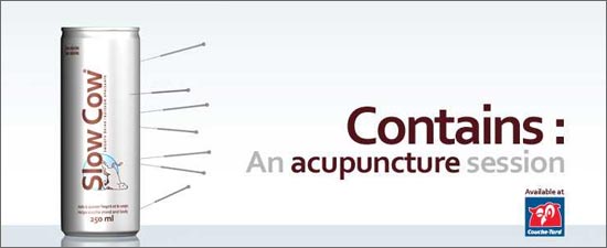
Hailing from Quebec, the anti-energy drink Slow Cow.

A new take on the enhanced beverage market, the drink relies on L-Theanine, Camomile and Hops, among other ingredients, to impart relaxation and calm.

Slow Cow

Red Bull is none too happy with this inverse clone, and has sent the company a formal request to close, on grounds of packaging and design infringements.

Are they really worried fans of their high-octane swill will switch to this soothing alternative? Or maybe just feel that they are being ridiculed. (They are…)

slow cow logoThe logo is brilliant (wish I could find a larger version). It deserves a wider audience.

Along with the Fail Whale, we should have the Slow Cow!

[Via @mjginnyc and Daily Fork]

Oops

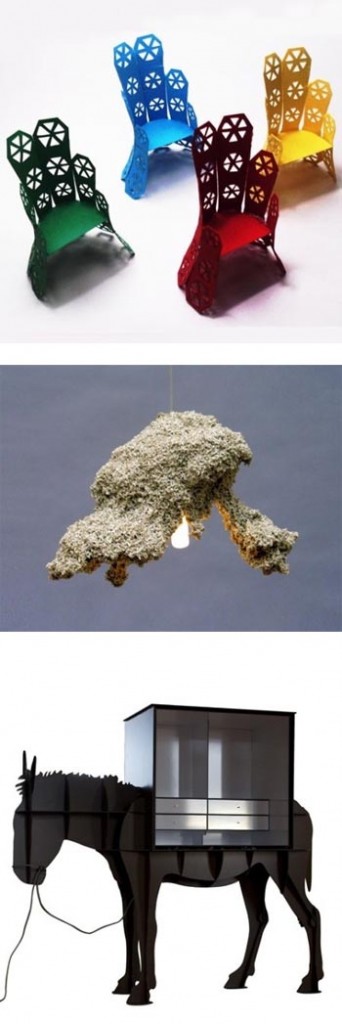
ugliest and silliestCourtesy of Andrej Statskij design studio in Latvia come the Oops Awards for bad product design.

In the search for new and original design ideas and executions, there have to be many misses.

Though many are relegated to design-showroom-only status, and never make it past prototyping, it’s fun to take a look at what we hope doesn’t appear in stores or homes.

The anonymous Oops Design Award Foundation began giving awards in 2008 for Ugliest, Silliest and Most Useless Product Design.

They have selected nominees for 2009.

One of the interesting concepts this award highlights is that bad and good design can be very subjective.

For example, as Core 77 notes, one of the chairs nominated for the 2009 Ugliest category has already won the Cicely & Colin Rigg Contemporary Design Award, which is totally serious and comes with a $30,000 prize.

Somewhat related, and definitely in my Oops category, is this house which is currently on the market for $4 million (recently slashed from $5.5 mil).

Comments on the hideous “live-in” scuplture ranged from “That just made my eyes throw up” to “Dr. Seuss on acid.”

But someone is bound to buy it, because it’s different.

Much like the apparel that shows up on the catwalk during fashion weeks around the world, these designs are pushing the edge of what we recognize as attractive, in the name of innovation.

I suppose looking at what’s bad helps us define what’s good.

Without rainy days, who would as much appreciate the sunny ones?

Give Me Liberty, Or…

ladylibertyThe marketers for the Residences at Two Liberty Place must really know their target demographic.

Why else would this call-girl-esque model be the main feature of their advertising, both in print and on their website.

When I first viewed their outdoor ad, I didn’t even get the connection between the name of their building — Liberty II — and the Statue of Liberty, from whence they derived this Lady Liberty character.

Really thought it might be an ad for a high end sex club, or one of those hotels that rents by the hour.

Even the copy suggests that the “private tour” might be more than just a look ’round an empty apartment.

Guess these people are sure they won’t offend the women/wives choosing to pay ridiculous prices to live in their highrise.

Philebrity puts it well: “Don’t hate me because I’m beautiful. Hate me because I’m the exact kind of asshole who’d pay $2M for an apartment with no opening windows.”

Yup, that’s the demographic. If they really wanted to go all out, they’d do another ad with Cole Hamels — a building resident — in the same kind of seductive pose.

Then they could really give the Parker Hotel some competition.

Cough-y

Today, May 5, is the official national launch of McDonald’s new Starbucks competitor — the McCafé. The company is pouring their marketing and advertising hearts and dollars into the effort. Word from the company is that it’s the largest campaign it has launched since it began selling breakfast in the 1970’s.

They have at least five completely different websites dedicated to the cafe-styled line of espresso based drinks, which is marketing 101 these days. The design of the sites is nice, but the content? A bit questionable:
McDonald's Art

mccafecoffee.com — Basic site, showing off what appear to be the cafe’s three offerings: latte, cappuccino and “mocha.”

mccafeicedcoffee.com — Interactive! “Skate” around an ice rink by controling a coffee bean with legs using the arrow keys on your keyboard.

wakeuptowhatsnew.com — More interactive! Make your own digital cappuccino art by pouring digital steamed milk into espresso.

mccafesnowflakes.com — even more interactive! make your own… um… digital coffee-ring snowflake??

mcdonalds.com/mccafe — With the ever so classy slogan “Give it up for the accent mark!” and a video-intensive game-show-movie-esque content

Who is the target audience for these websites, again?

As for the actual cafes, the interiors are full of wood and artwork, soft lighting, benches and spots for lounging. There have actually been McCafe’s in other countries around the world since the 1990’s, but it took the recession to convince Micky D’s that they could lure can’t-afford-it-every-day-anymore-ex-Starbucks drinkers through their stigma-ed arches.

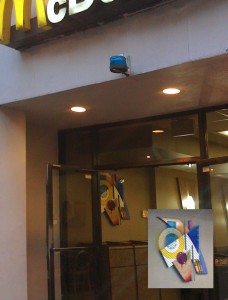
Supposedly there are several in the Philadelphia area already. Can’t speak from experience, though. There doesn’t appear to be one yet in the Rittenhouse Square location, hidden between high-end fashion retailers on Walnut Street, though that restaurant (can you call it that? fast food joint?) does have some unique, non-chain-looking art hanging.

The Wrong Job

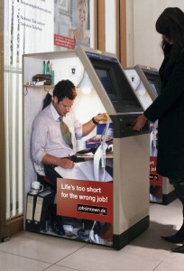
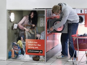
The Wrong Job 1Great series of ads for jobsintown.de.

Not sure it would work here in the US; people would mostly ignore them as they rushed around their busy days.

Or maybe not. They are incredibly eyecatching. Large photos. Minimal copy. Creates curiousity. Gets the message across.

Good design meets good concept.

By Scholz & Friends, Berlin.

Check out a few more in the series here.

The Wrong Job 2

Clock Blocked

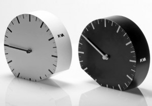
oraillegaleDennis Guidone designed this beautiful clock which will be on display for Milan Design Week and eventually produced by NAVA.

As others have pointed out, this clock has but two functions: (1) it tells time; and (2) it makes resetting the time for daylight savings a snap: you simply tip it over to the other side of its “base.”

Because you know how annoyed you are having to re-figure out how to set all the digital clocks on your microwave and stove. You’ve done it once, already, but that was almost a year ago!
oraunica
Maybe the clock would tip over on its own, and I’d show up an hour early or late. Because of this, I’d carry around a photo of the clock as my ready-made excuse. Not so bad.

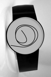
This watch by the same designer comes with the same built in alibi: “I thought I was on time, I really did…  “

Bat-ronaut

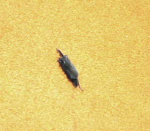
The BatTangentially design related, but a follow up to my previous post about the International Space Station: Apparently a free-tailed bat was a stowaway on the fuel tank of the Discovery shuttle mission that made the recent delivery to the ISS.

It held on as rocket boosters fired and held on as the shuttle headed up above the launch tower. It is thought to have eventually been shaken off and incinerated. (A bat expert who inspected the pics after the fact postulated that it had a broken wing, and so couldn’t fly away sooner.)

After the bat was discovered during pre-flight walkthroughs, shuttle engineering did debris analysis on him and ultimately a waiver was written to accept the stowaway and allow the launch to continue as planned.

This was reported on the news at the time but I missed it. Aww. Poor bat. But great that the sensors and monitoring of the shuttle takeoff can notice such a miniscule thing. Can’t wait for 2001-like space flights. I hope in my lifetime. I hope.

UPDATE: Images now link to larger versions…

Bat Tech