Extra Dimensionz

.
Watch the (very short) video above, and know this: realistic 3D holographic prints are now within reach.

The only thing needed to view the full-color, 360-degree images is a halogen or LED light source, no special glasses or projectors required

Building on hologram technology first developed in the 1960s, Zebra Imaging has applied advances in lasers and optics to take 3D data (from Google SketchUp, AutoCAD or Maya, for example), record them as highly-detailed hogels (the pixel building blocks of a hologram), and print them onto a malleable film substrate.

A good analogy for understanding how a holographic print works – on a simple level – is to think of an audio recording taken of an orchestra, then played back through a surround-sound speaker system. The original source points (of sound) have been captured in relation to a specific center, and can then be reconstituted to give the impression of a 3D soundscape. With light, the process is a bit more complex, especially when creating images like these that stay three-dimensionally realistic through a very wide field of view.
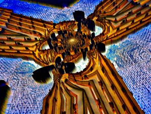
Thousands of Zscapes have been provided to the US Military over the years, for use in strategic planning, but prices for a color 12″ x 18″ version are now as low as $1,500, well within range for a non-Defense Department business. An Engadget commenter suggested Disney could use these to cover the walls of a roller-coaster ride tunnel. ArchDaily recently called them the “future of architectural visualization.” And artist Mark Henninger  (my husband) is considering commissioning Zscape art prints of his psychedelic extrusion images.

The exo-dimensional print also gave rise to a new thought: If we can see this thing in three dimensions, when it very obviously only exists in two, can the ruse be replayed on a higher level? What if the fourth dimension we experience as time is also an illusion of sorts, a trick played by our perception of matter and energy? Will we eventually be able – perhaps like a Star Trek holodeck character – to print out a life?
Black & White & Red Sauce All Over

Gemelli, it says on page 114, “is an example of  pasta architecture at its best.”

Yes,  PASTA architecture.

There are hundreds of different shapes and figures of noodles, dumplings and other dough designs.

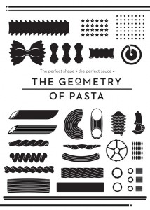
The Geometry of Pasta is an intriguing and appealing exploration of this world.

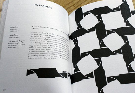
Each chapter in the alphabetically organized cookbook describes a certain pasta, looking at the history of its contours, ingredients and etymology.

With a nod to function following form, co-author chef Jacob Kennedy provides recipes using types of sauces or accompaniments that best suit each pasta’s design.

In Italy, this pairing of shape and flavor is an essential component in construction of the perfect pasta dish.

That’s what gave graphic designer Caz Hildebrand, the other author, the idea for the book.

But it’s Hildebrand’s gorgeous black and white illustrations that really bring the pages to life, vividly showcasing the diversity of forms and figures.

Combined with snippets of old Italian wisdom (“He who looks at magnitude is often mistaken: A grain of pepper conquers lasagna with its strength.“), the bold graphics make this a book you won’t want to put down, even when it’s time to cook.

Who knew grayscale line drawings could make you so ravenous?

[Thanks to Eric Smith at Quirk Books for the review copy, and h/t Drew Lazor at Citypaper]

A Priori – Very Cute

Definition: A priori knowledge is knowledge which can be established independently of experience or reasoning from experience.

priori-blue-orange

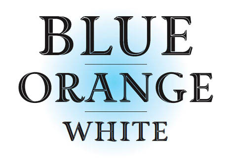
The beautiful new titling font by British designer Jonathan Barnbrook is named well. Priori Acute establishes it’s own rules of dimensionality.

Developed through experimentation, the font presents optical illusions of depth — using techniques similar to that of Dutch graphic artist M.C. Escher — that present impossible perspectives.

Barnbrook also cites the shapes and angles of the Stealth Bomber as inspiration.

Though his graphic design, Barnbrook is active in political & social causes, and has a  stated ambition to use ‘design as a weapon for social change.’

The font is available for $50 from Emigre and comes packaged with a set of ornamental elements that can be tiled into mesmerizing patterns.

View the whole alphabet and some of the patterns after the jump. Continue reading A Priori – Very Cute

To Slick or Not Too Slick?

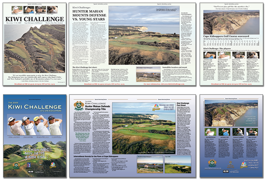
A client recently paid for an advertorial (“special advertising section”) in a national publication.

Included with the placement price was design & layout of the 4 page piece.

The idea was — as it usually is with these segments — for the in-house art department to use our photos and logos to create a layout that was in-line rest of the magazine, so that readers would not simply skip over the section on their way to the next article.

However, when the proof came back, my clients hated it. And I had to agree.

It looked… mostly… blah.

golfweek_sm

Whether or not it looked like an article in the rest of the magazine (and I don’t believe it did — I’m not convinced it wasn’t thrown together by a first-year college intern), it was lacking in design.

It did not intrigue, fascinate or sell!

Although the final art deadline was within 24 hours, I volunteered to redesign the piece.

Clients = happy.

In other words: advertising should be slick.

Blame Canada?

poor coleNo. Not really. But I am ashamed that the agency responsible for these ads is probably Philly-based.

I already wrote about the odd tone of advertisements for the condos at Liberty Two (viva Lady Liberty!).

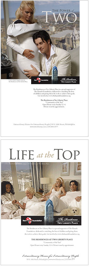
I speculated that they could do another ad with building resident and Phillies ace pitcher, Cole Hamels.

Well, they did.

As Philebrity and a ton of others noted when these came out in Philadelphia Magazine, the ads are pretty ridiculous.

Is that Cole, Elvis or KD Lang hugging the orange pregnant Heidi?

Why are random children playing in Cole’s bed?

Is this apartment in a hovercraft to obtain that angle of view out the window?

Anyway, bringing this up now because if his pitching is not up to par in today’s game 2 of the National League Division Series, I put all blame on the creative director who came up with — and subsequently approved — these ads.

Okay, and maybe Cole’s agent, too.

Update: Le sigh…

Give Me Liberty, Or…

ladylibertyThe marketers for the Residences at Two Liberty Place must really know their target demographic.

Why else would this call-girl-esque model be the main feature of their advertising, both in print and on their website.

When I first viewed their outdoor ad, I didn’t even get the connection between the name of their building — Liberty II — and the Statue of Liberty, from whence they derived this Lady Liberty character.

Really thought it might be an ad for a high end sex club, or one of those hotels that rents by the hour.

Even the copy suggests that the “private tour” might be more than just a look ’round an empty apartment.

Guess these people are sure they won’t offend the women/wives choosing to pay ridiculous prices to live in their highrise.

Philebrity puts it well: “Don’t hate me because I’m beautiful. Hate me because I’m the exact kind of asshole who’d pay $2M for an apartment with no opening windows.”

Yup, that’s the demographic. If they really wanted to go all out, they’d do another ad with Cole Hamels — a building resident — in the same kind of seductive pose.

Then they could really give the Parker Hotel some competition.

The Wrong Job

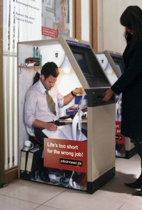
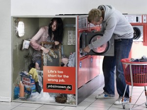
The Wrong Job 1Great series of ads for jobsintown.de.

Not sure it would work here in the US; people would mostly ignore them as they rushed around their busy days.

Or maybe not. They are incredibly eyecatching. Large photos. Minimal copy. Creates curiousity. Gets the message across.

Good design meets good concept.

By Scholz & Friends, Berlin.

Check out a few more in the series here.

The Wrong Job 2

Fast and Easy

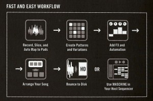
fast_and_easy1This graphic of icons better describes what the incredible new groove box Maschine does than all the words about it on their box, online, or in manuals. 

A true example of great design by Native Instruments.

Ahem…

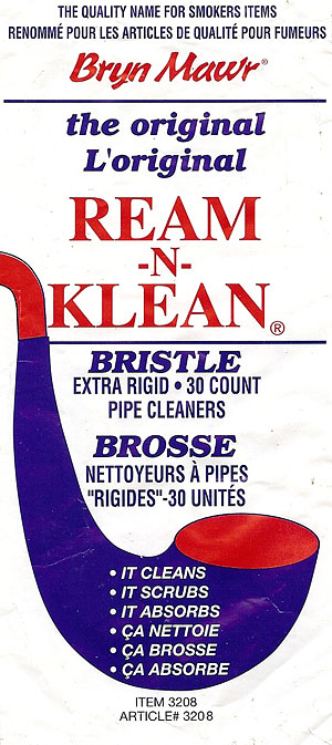
Ream-n-KleanI really always wonder how product and brand designs like this can hang around as long as they do.
Perhaps it’s a matter of “if it ain’t broke, don’t fix it.” Or perhaps they still have printed bags left over from the 1930’s? Doubtful. But amusing.

Okay, not to mention the product name itself. Also a relic from earlier times, I imagine.

And Bryn Mawr Smokers Sundries is now Chenille Kraft Company in Illinois, with a single graphic placeholder website.

Maybe I should offer them my services…

Was It Better Then?

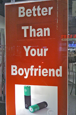
better thanProofreading is important in print design, and that means more than running spell check. The omnipresence of auto spell check has allowed designers to become much more lazy on this point.

Instead it should make them more vigilant (note to self!), because this reliance makes it easier for other kinds of errors to make it into final products.

For example, grammatical inaccuracies. Or simply typing “cat” instead of “can”. Or using the wrong version of a homonym.

Fixing those that do slip by can look almost as silly as the mistake in the first place.

For example, this sign in a shop on South Street has a word cut out of it and replaced. It immediately caught my eye — I was just walking past, rather quickly, when I saw it (okay, okay, I admit, I shop there everyday… ;).

It looks silly, and makes the whole shop look kind of second-rate, which it’s not (it’s actually a rather fancy “erotica shop”).

My husband speculated that maybe this was part of a marketing campaign, a sign with a changeable tag line. We pondered what other slogans could be featured:

“Better LEAVE Your Boyfriend”
“Better WANT Your Boyfriend”
“Better KILL Your Boyfriend”

None of which seemed as likely as the mixup of then/than making it all the way to the final printed poster.