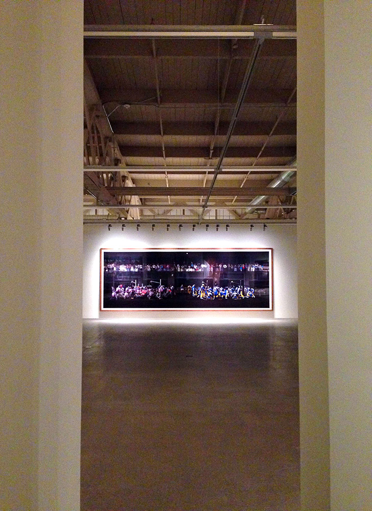
Everyone is a photographer now, and that’s wonderful. We all document moments both important and mundane, scenes both amusing and stunning, creating a colorful whirlwind that turns into an extra layer of the fabric of life. Step into the serenely industrial galleries at Pier 24 in San Francisco, though, and you’ll be reminded that photography can also be art.
A huge variety of photographic prints make up the current exhibition (“A Sense of Place,” open through May 2014), but it’s the gallery space itself that is most intriguing. Continue reading Pier 24 SF
Since breaking ground in 2007, the impressive, 100,000-square-foot structure has been steadily rising, on time and under budget, just across from the Liberty Bell and the National Constitution Center.
The new location is a stone’s throw from the museum’s former home in a building shared with congregation Mikveh Israel. The old facility offered less than 2,500 sq ft of exhibit space.
Almost complete, the five-story outer facade glints in the afternoon sun, awaiting installation of an 8-foot LED light sculpture that embodies the qualities of a flame.
James S. Polsheck, founder of Polshek Partnerships (now Ennead Architects), whose past works include the Rose Center for Earth & Space in New York City, designed the outer glass structure to symbolize the translucency afforded Jews who have found sanctuary in America, and the fragility of this freedom.
Each floor of the museum opens onto a terrace encased in this artfully glazed glass, offering fantastic views and a space to clear your mind as you traverse the capacious exhibits.
Inside the glass, a terra cotta cube defines the inner volume. This hearty structure represents the solidity of the liberties that protect all Americans.
Warm anigre wood and cool glass create an exciting interior, focused around an 85-foot high atrium lit from above by skylight.
The top floor is event space, and already has several weddings, bar mitzvahs and other gatherings on the books.
Throughout the rest of the $150 million building, the extensive collection of Jewish Americana (the largest in the world, with over 25,000 artifacts) will be supplemented by a series of truly innovative displays. Continue reading Rekindled
The recently opened Dostoevsky Station in the Moscow subway has all of that, and more.
One of a series of metro stations named after Russian literary heroes, Dostoevskaya features murals that depict scenes from his famous novels such as Brothers Karamazov, The Idiot and Crime and Punishment, as well as a stern portrait of Fyodor himself.
The wall art is austere, featuring black and white silhouettes of the books’ characters in action: a man is raising a gun to his head. Another holds an ax above his, waiting to bring it down on a women nearby. Continue reading Arts and Punishment
On first glance, it’s not easy to tell that these are all photos of the same building.
This private art gallery in the Philadelphia suburbs was designed to look different from each and every angle. And to have a certain ambiance when morning sun strikes it, one that is distinct from when the sun is beaming down overhead, and different still from that on a gray day.
Each glass panel of the wall is a different shape. Each of the wood-like slats that cover one side tapers outward, changing in width.
Even the greenery of the surrounding lawn has been designed in irregular patches of flower and grasses, blooming and sprouting in different shapes as the seasons progress.
Yet the gallery also performs at its intended function, showcasing artworks without exposing them to direct sunlight. An asymmetric wire mesh drapes in artful curves over a wireframe beneath the high ceiling; the structure will allow for artworks to hang in almost any configuration.
Spend a few minutes talking to John Shields, and you get the impression he’s a dreamer. But his firm, point b, has had great success in putting inventive design ideas into practice. Continue reading Getting There
Over the past decade, automated parking systems have become quite common in Europe and Asia, where land use constraints are tighter and many areas more congested than the US.
Automated parking systems can fit up to 20 cars in the footprint that would traditionally house just four.
The number of automobiles produced worldwide may actually be on the decline, but we still crank out over 50 million cars each year.
Along with the new trend of “bright flight“, American city developers are feeling the capacity crunch, and auto-auto-lots have begun to appear here as well.
Although the first of these facilities — built in Hoboken, NJ in 2006 — was plagued by technical glitches and failures (little things, like dropping an unoccupied Cadillac 6 stories…), the technology has advanced quite a bit since then. Working automated lots are in use in Washington DC and New York City, with more planned for other locations.
The fourth automated lot in the country — and the first in Philadelphia — has just opened below ground at 1706 Rittenhouse Square Street.
Garage entrance
The compact, underground lot was crucial in getting the luxury, single-residence-per-floor tower approved and built. The small space, just off of Rittenhouse Square behind the Curtis Institute, had been a surface parking lot owned by Philly-based Parkway Corporation for the past several decades.
Parkway teamed with Scannapieco Development Corp and asked Cope Linder Architects to come up with a design that would maximize potential of the parcel. The group’s plan was to fit into the historic neighborhood and keep the tower’s footprint relatively small and set-back by incorporating an underground automated garage.
1706 Rittenhouse’s is the most advanced model on the market, designed by German manufacturer Wohr, who have been building automated garages since the 1970s. “It’s run by incredibly sophisticated software,” said Cope Linder partner David Ertz.
Koi pond & garden, instead of a surface lot
As residents of the building swipe a fob past a reader next to the elevator, the garage robot searches out their car, slides its pallet onto a lift, moves over to the entrance and raises the selected car to ground level, facing the street. A rep from Quality Elevator, in charge of maintaining the system, estimated the time it takes the car to arrive at 60 seconds or less. “It’s really just a big elevator,” he said. [6ABC has a video of the process]
The parking lot, like the rest of the tower’s design, is understated. The limestone facade that echos design cues of the older buildings on the small alleyway transitions to concrete on the upper floors, and is so minimal it’s in danger of being boring. But the 360-degree windows on each level and the attractive curbside koi pond and garden make up for it.
And they certainly look better than a gaggle of automobiles, sunning on the surface.
Most likely, it is a property of the human mind. An algorithm, like time, that helps consciousness make sense of the world around us.
That our idea of space is relative can be illustrated simply, without need to delve into quantum physics.
Take the “Magic Mirror” toy that was popular in the late 19th century. Images that appear to be distorted blobs become detailed drawings when viewed in a different way — in this case as a cylindrical reflection. This is an example of anamorphosis, which has been used in art since Leonardo Da Vinci and by many since, including Salvador Dalí and Marchel Duchamps.
Putting the concept into practice in a very modern way is one of Swiss design firm Zmik‘s latest installations, appropriately entitled “Anna.”
The main corridor in the new offices of Swiss interactive firm iart is visually expanded by a series of large-scale drawings.
From five set viewpoints, these sketches coalesce to reveal wireframes of (both real and imagined) spaces behind the walls. Viewed from any other position, the design appears to be simply a rather random pattern of graphic lines.
Zmik describes the work as an “allegory for the quest of new perspectives.”
It can also be viewed as a metaphor for the “fixed vantage point” each of us holds in this journey of life, along with its accompanying limitations, biases and opportunities.
But this rigidity is changing. Whole new online communities — such as Twitter, World of Warfare, Second Life — are forming with their own, different rules of space and time.
Dr. Robert Lanza says, “Reality is simply an information system that involves our consciousness.”
Understanding consciousness and the way it shapes our worlds is the next big step in evolution.
Because of this, several neighborhoods are leaning on the restaurant boom: Cafe Cret opened on the Ben Franklin Parkway, and Franklin Square enjoyed great success bringing in SquareBurger.
South Street Headhouse District might be next.
A multi-step improvement plan is in the works. Philly Councilman Frank DiCicco secured money for the already-completed first phase. This past week saw the dedication of a new fountain at 2nd & Lombard.
The fountain, which had been in disrepair, now boasts a child-friendly, rubberized basin, colorful LED lighting and more seating. New, programmable water jets feature an ananemometer to measure wind speed and automatically adjust the height of the spray.
On one side of the fountain sit the Headhouse Shambles — home to one of Philly’s biggest & best farmers’ markets. On the other currently sits a mishmosh of parking spaces & asphalt.
Cope Linder Architects, who provided the design for Phase 1, have ready a preliminary design for this area which would reclaim much of the space from cars.
It involves an expanded, landscaped pedestrian walkway from the fountain up to the South Street end of the block, where a pavilion with a café will be built. Such a café might bring not only a steady stream of revenue from concession sales, but also encourage more pedestrian traffic for neighboring establishments.
Barry Essinger of Cope Linder even brought up the possibility of closing off the whole street on weekends or holidays, creating a vibrant. car-free mall like those in Buenos Aires or the new Times Square.
South Street is already morphing into a much nicer, more upscale tourist destination. This redevelopment would be a welcome bridge from South to historic Society Hill, and even all the way to Independence Mall and Old City.
What have all tiles been missing up to this point? Change. Most tiles, however beautiful, are static. Still. They are what they are.
Not any more. Moving Color offers up several lines of temperature-sensitive glass tiles.
Using anywhere between 20 – 80% recycled materials, this patent-pending product is offered in a multitude of styles and base colors.
Each tile changes color with the temperature, either ambient or via the touch of a human or of water.
The tiles can be carefully customized, with colors or patterns, so design opportunities abound. Bob Tonjes uses them to create “paintings” that change throughout the day.
From refined to organic to psychedelic, these chromatic slabs can be applied indoors or out.
At $29 per tile, they are not for everywhere, but can be well-placed as accents on fireplaces, outdoor tables, showers and more.
To really get a better idea of the changing beauty of these installations be sure to check out some of the flash animations on the company website.
Everything around us comes from nature. Computers, toasters, steel mills, polyester, even superconducting super colliders, all “natural” in origin.
Technology is nothing more than a human byproduct.
However, most of our creations are mal-adapted. Unlike the byproducts of all other living beings, most things we’ve designed are not degradable, not reusable, not able to change with the environment or be reabsorbed by it.
If we can change this, we can better secure the future of our society, our species and our planet.
Can borrow from the way life has been designing for thousands and thousands of years and tangibly apply these lessons to our modern age?
This is a growing movement — highlighted by a recent talk given by Dayna Baumeister of the Biomimicry Guild at BuildGreen09 — and there are real-world examples already in production and use. A few of my favorites:
This office and retail complex was designed to be ventilated and cooled by entirely natural means, and was one of the first to do so. By using passive cooling, the building consumes around 10% of the energy needed by a similar conventional structure. For inspiration, architect Mick Pearce and his engineers looked to the locally common termite mounds, which are built to catch any breeze and pull cool air in from the earth while sun-warmed air vents out through flues on the top and sides.
Top: close-up of moth's eye Bottom: close-up of MARAG film
Moths rely on light sources to communicate and find food and mates. Their eyes, unlike most other animal species, do not glint in the night, which would distract from important light sources (such as your porch lamp…). Moth eyes are anti-reflective. This is achieved with a surface covered with many micro-cone-shaped protuberances, which break up the light and stop it from bouncing back uniformly. MacDermid Autotype has reproduced this type of patterned surface and developed non-toxic, non-reflective films that can be used industrially.
When used to coat solar panels, for example, the non-reflective films will absorb much more energy from each ray of sun that hits. The easily-degradable anti-glare films are also used on computer and cell phone screens.
Almost half of the materials in our landfills end up there because of glue. For example, a simple chair of wood, metal and fabric is glued together so strongly that the parts simply cannot be separated in a reusable way. Most industrial adhesive is also toxic.
However, geckos and many insects walk on walls, and they don’t use suction to defy gravity. Instead, their feet are covered with rows of tiny hairs, that utilize molecular attraction to adhere to any surface. Scientists have begun producing tape and adhesives using this technique, resulting in glue-free products that can stick to dusty surfaces better, can be washed with soap and water, and can be reused multiple times.
Lotus flowers grow up through the muck of ponds and swamps and bloom into gorgeous, smooth, colorful flowers. The molecular structure of their petals makes it so that water not only rolls off, but carries with it any surface dirt. Companies like Sto Worldwide have mimicked these hydrophobic qualities, and produce exterior paint that is not only water-tight, but essentially self-cleaning, minimizing the need for detergents or for repainting at all.
These are all examples of the kind of design Dayna calls “fitting IN, instead of fitting ON.”
We need to keep stimulating this kind of innovation!
I’ll end with the same mantra she did, good advice for anyone, no matter what discipline or field.
The room is only there for a year, July 2009-July 2010, and it was put in place by a crane.
Only 12 reservations are available each day, and only for a few moments as the clock ticks over to 10 am Paris time.
You don’t get to pick your menu, nor your accompanying beverages.
But Art Home Paris might well be the most awesome restaurant in the world right now.
Designed by minimalist architect Pascal Grasso, the temporary structure sits atop the Palais de Tokyo museum, with a sweeping view of downtown Paris and the Eiffel Tower.
The dining space is called Nomiya, after a restaurant in Japan, seats 12, and is encased in floor to ceiling glass on three sides.
Chef Gilles Stassart’s open kitchen is protected by a metal skein, perforated in patterns reminiscent of the Aurora Borealis.
Meticulously prepared and plated with an eye for spatial design, the food is reportedly excellent.
Most online reviews are for lunch, instead of dinner, though. Reservations for dinner are simply too hard to score.
Guests can see the whole kitchen, and are invited to ask questions of the chef while he is plating.
Tours of the space are offered daily, as are workshops with the culinary director.
A garden sits on the roof level slightly below the restaurant, providing herbs and vegetables for the kitchen.
Though English words, the name of the restaurant is cleverer than it first appears: in French it is pronounced “arôme” (aroma).
 A huge variety of photographic prints make up the current exhibition (“A Sense of Place,” open through May 2014), but it’s the gallery space itself that is most intriguing. Continue reading Pier 24 SF


