Arôme with a View

The room is only there for a year, July 2009-July 2010, and it was put in place by a crane.

arthome2

Only 12 reservations are available each day, and only for a few moments as the clock ticks over to 10 am Paris time.
arthome3You don’t get to pick your menu, nor your accompanying beverages.

But Art Home Paris might well be the most awesome restaurant in the world right now.

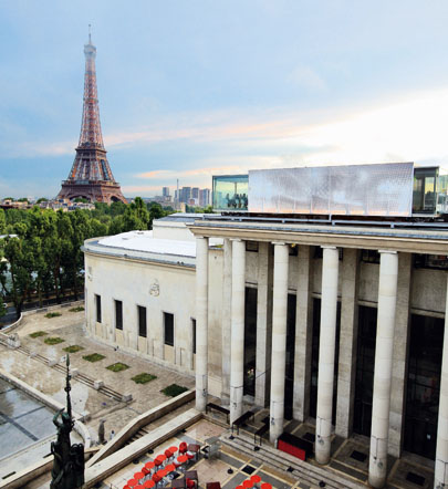
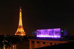
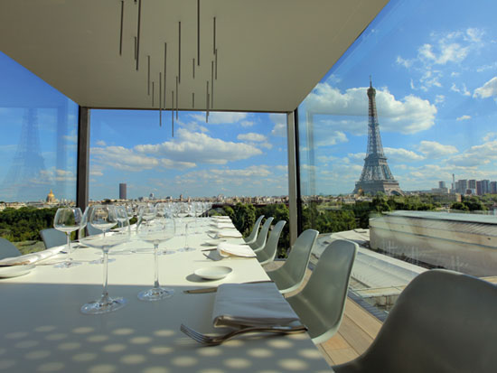
Designed by minimalist architect Pascal Grasso, the temporary structure sits atop the Palais de Tokyo museum, with a sweeping view of downtown Paris and the Eiffel Tower.

The dining space is called Nomiya, after a restaurant in Japan, seats 12, and is encased in floor to ceiling glass on three sides.

arthome4Chef Gilles Stassart’s open kitchen is protected by a metal skein, perforated in patterns reminiscent of the Aurora Borealis.

Meticulously prepared and plated with an eye for spatial design, the food is reportedly excellent.

Most online reviews are for lunch, instead of dinner, though. Reservations for dinner are simply too hard to score.

Guests can see the whole kitchen, and are invited to ask questions of the chef while he is plating.

Tours of the space are offered daily, as are workshops with the culinary director.

A garden sits on the roof level slightly below the restaurant, providing herbs and vegetables for the kitchen.

Though English words, the name of the restaurant is cleverer than it first appears: in French it is pronounced “arôme” (aroma).

Beautiful & delicious.

arthome1

[via Shola & dezeen]

The Origin of the Origin of the Species

Ben Fry is a master of computational information design — of visualizing data.

Humans are very visually oriented.

Organizing information into a well-designed schematic allows us to digest huge amounts of information, and can reveal otherwise unseen connections or structures.

This is a relatively new but exploding field. The New York Times has a great team who regularly create fantastic visualizations to accompany and elucidate articles, and even has a visualization lab, where users can access ready-made data sets and design and submit their own.

origin-visualization

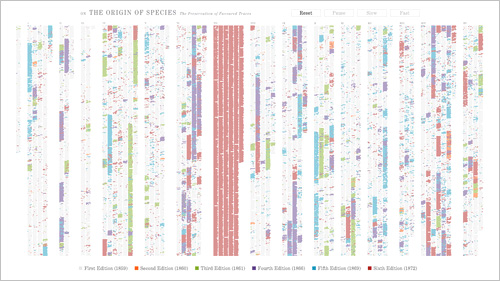
Here, Fry has created an interactive visualization of the changes between Charles Darwin’s six editions of On the Origin of the Species, his famous manifesto on the theory of evolution.

Starting from the first edition, changes are animated into existence, differentiated by color. By the end of the final edition, the resulting image looks almost like abstract art, in the vein of Mondrian.

But this is information design, and rolling over any part of the illegible multi-colored columns will highlight and enlarge the text, allowing the user to read through it, and view the actual changes.

The data is sourced from the Complete Work of Charles Darwin Online, an impressive body of his publications, all digitized by Dr. John van Wyhe & team.

It’s an exciting time in data modeling, and in thought design.

[h/t @mkgold @clioweb @jcmeloni]

Technorati Thing

Seems I have to post the code below to claim my blog on Technorati? Hmmm.

k8p254tu8s

We shall see.

Meanwhile, check out this nicely designed single-serve coffee machine by WMF. I refuse to write a whole post about it on the basis that I’m sure it doesn’t make excellent coffee. But my coffee standards are very high, and it’s probably very handy.wmf coffee pad

[via Living with White, one of my new favorites]

The Fourth Dimension Squared

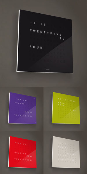
qlocktwoA beautiful amalgam of word and industrial design, the QLOCKTWO tells time in a “typographic format.”

It has a quadratic matrix of letters, where some of the letters are illuminated. The time is displayed in five minute intervals. Just like how people talk to each other. If you need to have a more exact time, look in the corner at the illuminated dots.

It’s available in an impressive six different languages, and five different colors (though according to their twitter feed, it appears they are offering a new “qolor” STEEL as well).

Released in Spring 2009, QLOCKTWO is handmade in Germany, so although the price was lowered after a flurry of press and awards, it will still set you back €885 (around $1,265).

At the heart of this square beauty is a DCF-77 time-signal receiver, so you don’t ever have to set the time. There are four brightness modes, and an auto mode that adjusts according to ambient light.

Bonus: There is also a 99 cent  iPhone App, in German and English.

Additional geeky bonus: The image of the clock on their website displays the actual time, syncing with the clock on your computer.

Super cool.

[via swissmiss]

Want To Change Your TypePad Domain Mapping?

(Note: This post somewhat of a story, but also has some useful code design info.)

Domain mapping is a handy and common way to set up a custom URL for your hosted blog, such as one on TypePad.com, WordPress.com or Blogger.com.

This allows you to use MyExample.com to reference your blog, instead of something like myexample.typepad.com.

Better?But what if you want to change the name you originally set-up to something else? In the case of TypePad (and likely other platforms), this can cause serious issues.

All of your posts and images use the original name, such as in search engine listings, on trackbacks and more. So if you change the name, all of your old links will break. You might loose a bunch of RSS feeds that used the old links. And also, all of the images in your posts will be missing!

I ran into this issue for a client last week. A popular blog, with an average of 1,500 unique visitor per day, and over 2,100 posts, was essentially broken. Not acceptable.

Because of TypePad’s inept support I was forced to find a solution, which can likely be adapted for use on other hosted blogging systems as well. The answer lies in some simple .htaccess code. Read on to find out more. Continue reading Want To Change Your TypePad Domain Mapping?

All It’s Cracked Up To Be

Ideas in Food

I like to be inspired by my clients.

One of the best things about running your own business is the relative luxury of choosing with whom you work.

While sometimes time constraints force compromises in design and code, the best case scenario is when there is opportunity to address details.

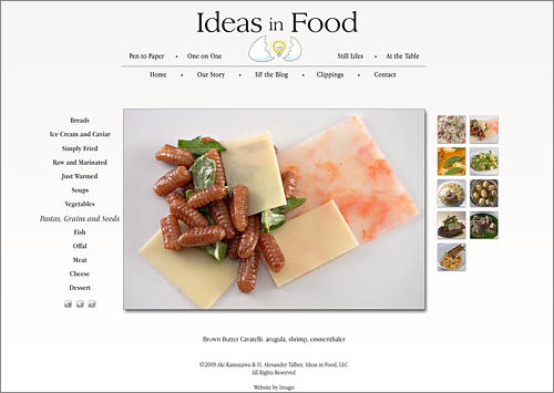
Aki and Alex have strong convictions and are extremely particular. Yet they are also avid explorers and open to new ideas.

This comes across in their food. Hopefully also in their new website.

www.ideasinfood.com

Hardwood Cycles

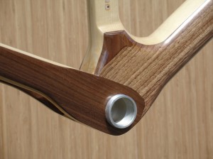
Renovo R4Ran into these gorgeously sleek bicycles with frames made of wood! And they are not just for novelty.

Apparently there are many benefits to these naturally sexy bikes, including strength, durability, weight (or lack thereof) and shock absorption.

Whereas in the past wood frames were only for show, these wonderfully performing frames are possible because of advances in adhesives and computer-aided machining.

Critics and users have put them on par with carbon-fiber vehicles.

From the Renovo Hardwood Bicycle website:

The real beauty of a Renovo frame is the ride, the looks are just a bonus.

Wood, nature’s carbon fiber, has unique engineering properties that promise superior ride quality and durability compared to man-made materials, and…it’s sustainable. When the right wood is combined with an array of advanced technologies, it becomes a high performance material that will forever change your understanding of ‘wood’.

Renovo R4 frameThe frames run from $950 to $2,500, which is well within normal pricing for high-end bikes.

Mmmmmmm.

[Via Core77]

Slow Cow

Hailing from Quebec, the anti-energy drink Slow Cow.

A new take on the enhanced beverage market, the drink relies on L-Theanine, Camomile and Hops, among other ingredients, to impart relaxation and calm.

Slow Cow

Red Bull is none too happy with this inverse clone, and has sent the company a formal request to close, on grounds of packaging and design infringements.

Are they really worried fans of their high-octane swill will switch to this soothing alternative? Or maybe just feel that they are being ridiculed. (They are…)

slow cow logoThe logo is brilliant (wish I could find a larger version). It deserves a wider audience.

Along with the Fail Whale, we should have the Slow Cow!

[Via @mjginnyc and Daily Fork]

Freestylin’

Coke Freestyle In UseThe soda fountain hasn’t changed much in basic design since it was first popularized and democratized in the late 1800’s by Jacob Baur, founder of the Liquid Carbonic Company, whose main contribution was the manufacture of carbon dioxide in easy to transport tanks.

At today’s dispensers, usually found in restaurants, you can choose from around six or eight different types of soft drinks.

In the Taste It room at the World of Coca-Cola in Atlanta, you can choose from 60 different kinds, which are dispensed from six separate cylindrical kiosks, taking up a whole room of the venue.

But now, starting in a few select Jack-in-the-Boxes (Jacks-in-the-Box?) in San Diego County, Coca-Cola is rolling out what they have dubbed the “iPod of drink machines.”

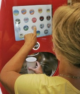
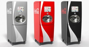
The Coca-Cola Freestyle lets the user select from over 100 varieties of soft drink from a touch screen.

This was enabled by rethinking the internal design of the dispenser, which uses small cartridges of concentrated flavor instead of bags of syrup.

Vince Voron, the senior director of industrial design at Coke, was recruited from Apple, so the comparison to iPod is more than fair. He notes that one of the challenges in designing the user interface was to make it friendly and not reminiscent of an ATM.

Coke Freestyle MachinesFast Company details some of the technology behind the machine: the “PurePour” used to mix in the flavors was originally developed for precise delivery of dialysis and cancer drugs; cartridges are kept in order using RFID radio frequency tags.

And in what should be good news for shop-owners and Coca-Cola alike, each Freestyler wirelessly communicates with HQ, sending info about what was consumed, when, how much, and receiving info about products that should be recalled or discontinued. (Guess with 100 flavors that’s more & more possible.)

Test markets this summer are said to include California, Utah and Georgia. Reason enough for a trip down South?

[via San Diego Tribune and Core 77]

Drawing on the Refrigerator

Kudos to Marjorie Amrom!drawing on the fridge

Last December the Philadelphia Streets Dept. ripped up the sidewalk corners in much of the Wash West/Society Hill area, one block at a time.

New signal boxes were erected and cast into the concrete, in anticipation of an (ongoing?) $12 million project to deploy digitized traffic signals throughout the city.

Because of a Federal DHS mandate to include future surveillance equipment along with the lighting equipment, the new signal boxes are huge, probably 3-4 times the size of the previous, pole-mounted ones.

As the Inquirer’s Inga Saffron points out with her usual acumen, these empty boxes look like huge brown refrigerators, and are an urban design nightmare in our neighborhoods of rowhouses.

On her blog she highlighted a few of the more egregiously placed metal monoliths, and noted that the flat sides were an empty slate almost begging for graffiti.

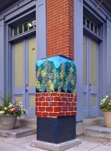
A prime example was this one, smack up against the historic house owned by Marjorie Amrom.

It appears that Amrom’s gone and had an artist paint a very attractive and colorful trompe l’oeil, or mini mural, all over the offending box.

Can we get the Mural Arts Program to commission a project to paint the rest?

UPDATE: Inga Saffron wrote another follow-up post, highlighting this box. She mentions that it might be “going a little too far” to paint all of the signal boxes like this. And a commenter points out that getting neighborhoods to agree on a design might “take as long as fixing the city budget.”

I still think it’s worth a try.