Turn It, Flip It, Pack It, Seal It

By flipping a to-go container top upside-down, Cuba Libre restaurant in Old City, Philadelphia, successfully solves one of the pressing issues of packing a restaurant dish to go.

The cold parts of the dish — in this case, a side salad — are placed in the bottom of the container, then a plastic top is turned inside-out and placed over it for protection. The shallow opening is then used as a double-boiler style container for the hot items (a trio of very tasty empanadas), which are capped by a second plastic lid.

SONY DSC

Continue reading Turn It, Flip It, Pack It, Seal It

Direct Connect

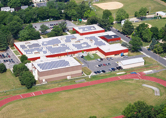
We recently had the opportunity to do an aerial photo shoot for Vanguard Energy Partners, a New Jersey-based company that manufactures and installs solar electric systems.

Among the subjects we photographed were:

A home, a farm, a high school, a municipal EMS building, a bank, a shopping mall, a courthouse, a warehouse and even a federal prison.

We also saw several other examples along the way.

Photo-voltaic cells are arranged in solar panels that live on rooftops and are connected to the structure’s main electrical panel.
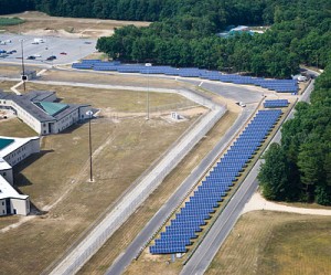
Energy is produced when the sun shines down and is converted into alternating current that is fed into the building’s power supply.

Solar panels are not new, but installation and use of these systems is on the rise around the world.

Germany leads the pack in wattage produced per capita, which is three times the number for Japan, and more than 15 times the per capita amount in the US.

Not only is this the most environmentally friendly way to produce electricity for a home or facility, it’s also cost-effective, greatly reducing electric bills.
You can even earn rebates on utility bills when any excess energy is produced — it’s sent back out into the main power grid. Federal and state tax credits help offset the initial cost of installation.

Seeing these installations all over the place — on all kinds of structures — was refreshing.

All of our energy comes originally from the sun, but solar panels allow us to capture it without a lot of polluting and wasteful intermediary steps.

Sun → electricity.

Instead of sun → plants → dinosaurs → petroleum → steam → electricity.

A direct connect.

[photos by Mark Henninger]

To Slick or Not Too Slick?

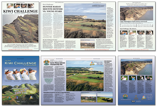
A client recently paid for an advertorial (“special advertising section”) in a national publication.

Included with the placement price was design & layout of the 4 page piece.

The idea was — as it usually is with these segments — for the in-house art department to use our photos and logos to create a layout that was in-line rest of the magazine, so that readers would not simply skip over the section on their way to the next article.

However, when the proof came back, my clients hated it. And I had to agree.

It looked… mostly… blah.

golfweek_sm

Whether or not it looked like an article in the rest of the magazine (and I don’t believe it did — I’m not convinced it wasn’t thrown together by a first-year college intern), it was lacking in design.

It did not intrigue, fascinate or sell!

Although the final art deadline was within 24 hours, I volunteered to redesign the piece.

Clients = happy.

In other words: advertising should be slick.

Want To Change Your TypePad Domain Mapping?

(Note: This post somewhat of a story, but also has some useful code design info.)

Domain mapping is a handy and common way to set up a custom URL for your hosted blog, such as one on TypePad.com, WordPress.com or Blogger.com.

This allows you to use MyExample.com to reference your blog, instead of something like myexample.typepad.com.

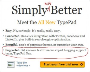
Better?But what if you want to change the name you originally set-up to something else? In the case of TypePad (and likely other platforms), this can cause serious issues.

All of your posts and images use the original name, such as in search engine listings, on trackbacks and more. So if you change the name, all of your old links will break. You might loose a bunch of RSS feeds that used the old links. And also, all of the images in your posts will be missing!

I ran into this issue for a client last week. A popular blog, with an average of 1,500 unique visitor per day, and over 2,100 posts, was essentially broken. Not acceptable.

Because of TypePad’s inept support I was forced to find a solution, which can likely be adapted for use on other hosted blogging systems as well. The answer lies in some simple .htaccess code. Read on to find out more. Continue reading Want To Change Your TypePad Domain Mapping?

All It’s Cracked Up To Be

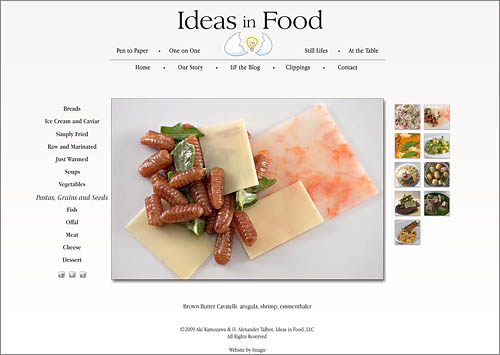
Ideas in Food

I like to be inspired by my clients.

One of the best things about running your own business is the relative luxury of choosing with whom you work.

While sometimes time constraints force compromises in design and code, the best case scenario is when there is opportunity to address details.

Aki and Alex have strong convictions and are extremely particular. Yet they are also avid explorers and open to new ideas.

This comes across in their food. Hopefully also in their new website.

www.ideasinfood.com

Semantics vs Aesthetics

The separation of content and style is a philosophy that is strongly encouraged in design, and especially web design these days.  The main idea is that this allows great flexibility. Colors and styles can be changed without affecting actual content — text or photos.  Different styles can be applied depending on how a visitor is viewing, such as via computer, mobile phone, or as a printed out version of a page.

It’s tricky to fully put into actual use, though, and most web designs I’ve seen or created mix style with content at least a small amount. 

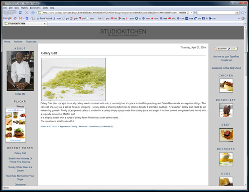
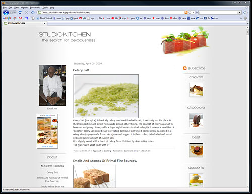
The one exception is blogs — especially template-based blogs hosted on providers like typepad.com and wordpress.com.  In this case, the content must be separate from the style, because the front-end content is constantly changing, being updated and rearranged by the blogger.

Additionally, in order to maintain full functionality offered by these services, the back-end, behind the scenes content also has to stay the same (for the most part), and can’t be changed or accessed by a designer at all.

This was the challenge I faced in redesigning the blog from my previous post to match the rest of my client’s (totally custom built) website.  I learned quite a bit more than I knew before about CSS styling during this project.  Perhaps I will post some tips on what I discovered. In general, a success.

Spry Gallery Goods

example galleryI am moving this post here from an old blog I started a few years back which has lain dormant for a while. The one post that did garner a bunch of attention was the Adobe Bridge script I cobbled together to automate creation of the XML needed to use the lovely photo gallery presented by the developers of Adobe Spry. I’ve used this script to create photo galleries for many client sites as well as my own.

I do plan on addressing code design here, so this is an appropriate place for the script to live.

Spry is a relatively new and easy-to-use AJAX library. AJAX use is very common on the web today, one of the technologies that powers what is often referred to as “Web 2.0.”

Basically, the technology allows webpages to change and update without requiring the user to “refresh,” “reload,” or navigate to another page.  For example: Gmail, which updates every incoming mail every so often without user interaction. And saves drafts every so often in the same fashion.

Find the download link and nuts and bolts of using the script after the jump.

Continue reading Spry Gallery Goods

Incarcerated Questions

two surveysOne of the most important goals of graphic design is to facilitate communication. I am surprised when people don’t recognize this fact. (Cough, cough, my dad, when I was describing this project to him!)
My sister, Tamar, runs a non-profit in New York City called the Women in Prison Project at the Correctional Association of NY. The CA has been around since the 1860’s, and has a mandate and a right, written into the NY State consitution, to monitor conditions in New York State prisons.

Tamar’s work focuses on the women’s prisons in the state, and in addition to inspecting and monitoring the prison conditions, her group also coordinates advocacy groups, lobbying efforts and re-entry programs.

Monitoring conditions in prisons, and reporting the findings, is a slippery slope. Physical visits to prisons need to be coordinated well in advance, and, like any inspection, a lot of “tidying up” will happen before the inspectors arrive. (Think cleaning up your house before a dinner party.) The resultant inspection will most likely find things in different state than they normally would be (Heisenberg’s uncertainty principle’s observer effect applies).

So Tamar decided to also gather data on prison conditions another way — by asking questions of the inmates themselves. 

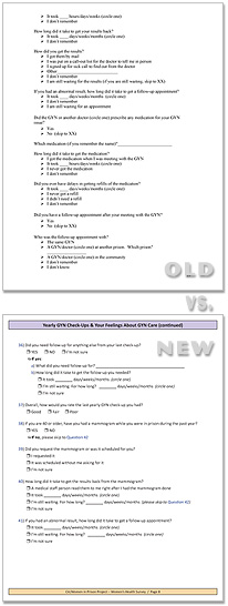
She enlisted me to help transform her pages upon pages of questions into something the inmates would want to pay attention to, something they might even view as fun, and not become bored with. We worked hard to create documents with enough color, whitespace, consistency and clarity to elicit a large and accurate response.

We’ve created a few different surveys by now, on general prison conditions, on reproductive health issues and more, that have been sent out to all incarcerated women in New York State, and the response has been very good. 

I learned quite a bit about graphic design of surveys doing this, but also a lot about design in social communication — how to craft each question, in what order to ask them, how not to be leading towards a certain answer, and how to view questions as your target audience would. This can be helpful in business situations just as well.

Check out one of our finished surveys here, if you wish.

Minimalist Design

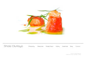
Sometimes I question my attraction to minimalism. When I work it’s usually a battle between my personal appreciation for minimalist design and the reality of a world filled with loud, noisy, look-at-me layouts. Shola Olunloyo

In advertising and marketing, you must get noticed. Get attention. A Call to Action! should shout from the moment a visitor first views the design, or else that visitor will quickly skip on to others. But what grabs the visitor doesn’t need to be a lot. It can be clean simplicity instead.

Most customers want attention-grabbing layouts. Usually I compromise my desired look by adding elements and colors.

In the case of my most recent website design, there was no such compromise, and I’m pleased with the results; the synchronicity of my and my client’s aesthetic.

www.sholaolunloyo.com