Cube-aholic

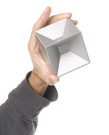
cubejigger2No, not as in someone addicted to Rubik’s Cube.

But for those addicted to appreciative of cocktails: the Cube Jigger.

Inspired by traditional Japanese sake cups, from which the drink is sipped at the corners, Philadelphia designer Josh Owen came up with this elegant bar tool in 2007.

Made from aluminum, the jigger provides an elegant way to mete out the six most common drink measurements, compactly arranged in a single 3″ x 3″ x 3″ cube.

Owen is an educator as well as designer, teaching at both UPenn and Philadelphia University. His design philosophy describes him as “simple, practical and quietly innovative” and states that he “defines function in humanistic terms.”

His other products range from clocks to socks to furniture and more, and have earned placement in museums and garnered many awards. (Love the Stoop Bench, created for DesignPhiladelphia 2009.)

Available online for $30 at Kikkerland or in person for $25 at Portfolio, the museum store at the Pennsylvania Academy of the Fine Arts, the Cube Jigger might just make it into our home bar collection very soon.

[via mealticketwe knew there was rationale behind our addiction to food blogs]

A Priori – Very Cute

Definition: A priori knowledge is knowledge which can be established independently of experience or reasoning from experience.

priori-blue-orange

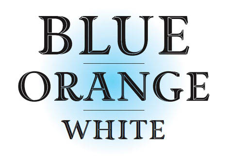
The beautiful new titling font by British designer Jonathan Barnbrook is named well. Priori Acute establishes it’s own rules of dimensionality.

Developed through experimentation, the font presents optical illusions of depth — using techniques similar to that of Dutch graphic artist M.C. Escher — that present impossible perspectives.

Barnbrook also cites the shapes and angles of the Stealth Bomber as inspiration.

Though his graphic design, Barnbrook is active in political & social causes, and has a  stated ambition to use ‘design as a weapon for social change.’

The font is available for $50 from Emigre and comes packaged with a set of ornamental elements that can be tiled into mesmerizing patterns.

View the whole alphabet and some of the patterns after the jump. Continue reading A Priori – Very Cute

Off the Lawn

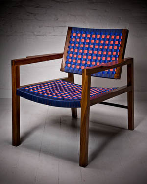
strap chair 1Tim Lewis is a furniture and lighting designer with a studio in Philadelphia whose Strap Chairs & Stools were recently featured on the popular design blog Core 77.

The clean, elegant wood frame is offset by the fun colors of the nylon that creates checkered patterns for the seat and back.

Over on Apartment Therapy, Kristen points out that Tim’s beautiful, handcrafted work is not cheap ($700-$1,600), but that it looks entirely worth the price.

We caught up with Tim via email and he was kind enough to answer some questions.

Read on for Tim’s thoughts on these re-imagined lawn chairs, the Philly design scene, how we should embrace a push to “buy locally” in artisan crafts  (just like the current “buy local” trend for food & drink) and his love of the pencil. Continue reading Off the Lawn

Is There a Café in the House?

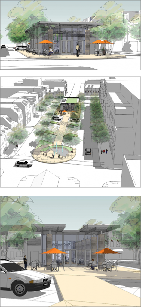
Headhouse Cafe RenderingsCenter City Philadelphia is in the midst of an urban renaissance.

For the first time since the 1950’s the census will show an increase in the city’s population.

The city’s restaurant scene is exploding with tons of new spots, including our new Iron Chef star Jose Garces’ & Philly pioneer Stephen Starr’s recent openings with more on the way.

However, funding for public spaces is scarce. (See: threat of no holiday lighting in Rittenhouse Square; on a larger scale, major downsizing & possible closures of the entire Pennsylvania park system.)

Because of this, several neighborhoods are leaning on the restaurant boom: Cafe Cret opened on the Ben Franklin Parkway, and Franklin Square enjoyed great success bringing in SquareBurger.

South Street Headhouse District might be next.

A multi-step improvement plan is in the works. Philly Councilman Frank DiCicco secured money for the already-completed first phase. This past week saw the dedication of a new fountain at 2nd & Lombard.

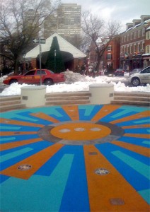
The fountain, which had been in disrepair, now boasts a child-friendly, rubberized basin, colorful LED lighting and more seating. New, programmable water jets feature an ananemometer to measure wind speed and automatically adjust the height of the spray.

On one side of the fountain sit the Headhouse Shambles — home to one of Philly’s biggest & best farmers’ markets. On the other currently sits a mishmosh of parking spaces & asphalt.

Cope Linder Architects, who provided the design for Phase 1, have ready a preliminary design for this area which would reclaim much of the space from cars.
fountainIt involves an expanded, landscaped pedestrian walkway from the fountain up to the South Street end of the block, where a pavilion with a café will be built. Such a café might bring not only a steady stream of revenue from concession sales, but also encourage more pedestrian traffic for neighboring establishments.

Barry Essinger of Cope Linder even brought up the possibility of closing off the whole street on weekends or holidays, creating a vibrant. car-free mall like those in Buenos Aires or the new Times Square.

South Street is already morphing into a much nicer, more upscale tourist destination. This redevelopment would be a welcome bridge from South to historic Society Hill, and even all the way to Independence Mall and Old City.

Build it! (and they will come….)

Steel Petals

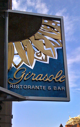
girasolePhiladelphia’s Girasole restaurant just added a beautiful, original sign to mark its location, just off Broad Street on Pine.

Instead of neon or plastic, the metal frame of the sign surrounds hand-crafted steel sculpture.

An elegant rendering of the restaurant’s name in bronze- and silver-colored cut metal rests over a blue-burnished background.

At the top, the restaurant’s signature flower (Italian for sunflower = girasole) shines down like the sun.

The overlapping petals — appearing somehow delicate, yet strong — allow glimpses of the real sky to peep through and are different on each side of the sign.

It’s a wonderful example of the work coming out of Chora Leone Art & Design in Atlantic County, NJ.

Jose Chora and Judy Leone have been creating together for over 15 years, and last year opened a gallery in Somers Point, NJ.

I caught up with Judy via telephone and she was kind enough to send over some additional photos of their works.  He works with the metals and she does the mosaics.

Peep some of their other artworks below. Continue reading Steel Petals

Rainbow Expo

kibisi logo
It’s widely recognized that Scandinavians have got something going when it comes to industrial design. (Most commonly known example: Ikea)

Three top Danish design firms have recently merged, forming KiBiSi, whose logo itself is a statement in functional modernism.

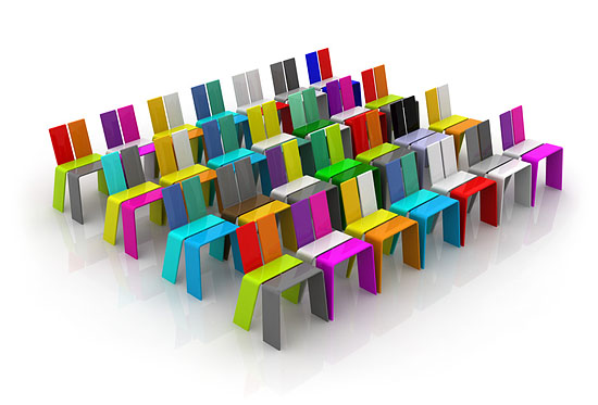
One of their first collaborations is the wonderfully happy EXPO Chair.

EXPO ChairThese are the chairs that will be placed in the Denmark Pavilion at the Shanghai Expo 2010.

This year’s World Expo in Shanghai has the tagline Better City, Better Life and is “just like an arena and stage for countries and international organizations worldwide to show their originalities and wits.”

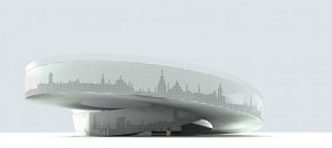
expo danish pavilionThe Danish Pavilion will be a Möbius-strip-like perpetual loop through which visitors can ride one of the free provided bicycles and get a feel for Danish life. In the center is a swimming pool filled with fresh water from Copenhagen, and topped off by their national monument “Little Mermaid” statue (that of Hans Christian Anderson — and subsequently, Walt Disney — fame).

With the colorful EXPO Chairs lining the way, it’s bound to be a cheerful ride.

[Via Core77]

In Living Color

What have all tiles been missing up to this point? Change. Most tiles, however beautiful, are static. Still. They are what they are.

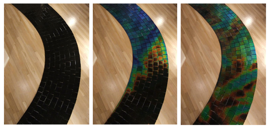
Not any more. Moving Color offers up several lines of temperature-sensitive glass tiles.

moving-color-path

Using anywhere between 20 – 80% recycled materials, this patent-pending product is offered in a multitude of styles and base colors.

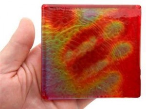
moving-color-handEach tile changes color with the temperature, either ambient or via the touch of a human or of water.

The tiles can be carefully customized, with colors or patterns, so design opportunities abound.  Bob Tonjes uses them to create “paintings” that change throughout the day.

From refined to organic to psychedelic, these chromatic slabs can be applied indoors or out.

At $29 per tile, they are not for everywhere, but can be well-placed as accents on fireplaces, outdoor tables, showers and more.

To really get a better idea of the changing beauty of these installations be sure to check out some of the flash animations on the company website.

moving-color-bowl

[Via Gajitz by way of @phi162]

Yikes!

The first mini-farthing bicycle has made its way to market.

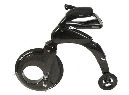
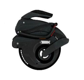
The YikeBike is an electronic powered transportation device that folds up to fit in a backpack.

yikebike1

Weighing less than 22lbs (10kg), it’s designed to go wherever bicycles do, plus some. Fold it, pick it up and hop on a bus, or even into a taxi.

YikeBikes can handle short curbs and bumps and have a tight turning radius.

yikebike3You sit upright, and grasp the handlebars by your sides, instead of leaning forward.

Combined with the anti-skid brakes and speed that is electronically restricted to around 12mph (20kph), YikeBikes claims this makes for a much safer ride.

None have shipped yet, though you can put down a €100 deposit to reserve one. When production nears, you’ll learn the full price, estimated to be between €3,500-€3,900 ($5-6,000).

Overall design is based on the penny-farthings, the Victorian hi-wheels that were the first actually efficient bicycles.

The YikeBike is motor-powered only, but the New Zealand-based company is looking for others to license designs to create a pedal-assist version, as well as a small size meant for kids.

They also postulate about future mini-farthing highways: light suspended roadways traversing a city; a kind of private public transit system, where the bikes could be freed to go much faster.

Hey, it’s good to dream. All in all, sounds better and more flexible than the Segway, and much better than Mr. Garrison’s IT.

[Via print edition of Time Magazine. I knew print was good for something.]

Quick, Call 9-1-1

311logomed1
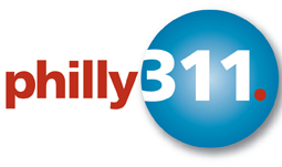
Because this logo needs serious help.

Or really, it needs to be put out of its misery.

The idea of a 3-1-1 non-emergency call center was pioneered in Baltimore in 1996. Chicago took it a step further in 1999.

New York City’s is the largest, and it has been quite successful since starting up in 2003.

Philly’s fledgling project, which was launched Dec 31, 2008, has been received with mixed results.

The program is without a doubt a step in the right direction.

Philly311 is on twitter, is set to receive their millionth call, and even monitors the neighborhood citizens’ reporting site SeeClickFix.

However, in August the hours were cut back from 24/7 to business hours only.

Public perception will play a large role in the future growth and funding of the program. Design is key in this regard.

logo_311_NYC This logo does not help. It is overly complex. It looks like many other company logos, without really being as nice as any I can think of. It is not an easily recognizable shape.

And mostly, this logo does not convey easy access to information and help. Much the opposite: the unbalanced colors and shapes suggest a frenzied, harried, mess.

NYC even has a whole set of different logos and posters available for download based on their clear, straightforward logo.

Anyone in Philly Gov have authority to hire a logo designer? 😉

Sticks & Twigs

canapes
But not the kind that only vegetarians eat.

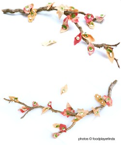
Foodplayerlinda has made a design breakthrough in hors d’oeuvre-ature.

She was inspired to ignore the leaves piling up in her yard.

Instead, she developed a new method for creating and presenting “cheese and crackers.”

Read the story here. Recipe included!