Why We Design

Just a poignant note on how designing is a privilege, and important at the same time, by John McWade, publisher of Before & After Magazine.  He writes of a reader writing in from Haiti, a farmer-cum-desktop publisher, who says:

“I am coming to believe that pleasing design needs no apology, even, if not especially, in scientific publications. Our societies are now at the stage that a great number of us can not only appreciate the pleasures offered by good design, but almost demand that artistic expression be placed on the same level as informational expression. I’m not sure why, but it has much to do with why we are human.”

And John notes:

Such contrasts these are! Here is a reader, a farmer, who has worked 15 years in a nation where half the children are undernourished and 1 in 10 will die, 7 of 10 adults are illiterate, half the urban population has no access to safe water . . .

. . . pause here for a moment . . .

. . . writing to a magazine subtitled “How to design cool stuff”. . .

. . . inspired by what we do.

What accounts for this? How does design even exist in such an environment, much less inspire?

You might look again at what you do. You sit with a full tummy in your warm office at a blank screen with an ad to make, and you’re thinking, “Jeez, I have to come up with something original and clever and it better be soon.” That’s not how to think. As a designer you have a privilege, one that others do not. It is the privilege of making visible that which others can only imagine, feel or think. When you do this, you open a window through which your audience can see, know and understand.

Full post here.
Semantics vs Aesthetics

The separation of content and style is a philosophy that is strongly encouraged in design, and especially web design these days.  The main idea is that this allows great flexibility. Colors and styles can be changed without affecting actual content — text or photos.  Different styles can be applied depending on how a visitor is viewing, such as via computer, mobile phone, or as a printed out version of a page.

It’s tricky to fully put into actual use, though, and most web designs I’ve seen or created mix style with content at least a small amount. 

The one exception is blogs — especially template-based blogs hosted on providers like typepad.com and wordpress.com.  In this case, the content must be separate from the style, because the front-end content is constantly changing, being updated and rearranged by the blogger.

Additionally, in order to maintain full functionality offered by these services, the back-end, behind the scenes content also has to stay the same (for the most part), and can’t be changed or accessed by a designer at all.

This was the challenge I faced in redesigning the blog from my previous post to match the rest of my client’s (totally custom built) website.  I learned quite a bit more than I knew before about CSS styling during this project.  Perhaps I will post some tips on what I discovered. In general, a success.

Residual Chance

I was recently reminded of the saying, “Luck is the residue of design.”  This quote* was the title of a lecture given in the 1950’s by Branch Rickey, former Major League Baseball executive. He was most famous for initiating the integration of major league sports by signing Jackie Robinson to the Dodgers in 1947.

I am a believer in this saying. How to put the concept to use is another question.

One can pretty easily design to have bad luck. For example: get drunk at a bar and drive home while speeding. High chance of bad luck finding you, in one of a myriad of ways.

Good luck is not quite so easy to run into. We don’t know in advance what juxtapositions will be useful to us, and it’s certainly not only high-minded, “good angel” decisions that allow for fortunate chance meetings or ideas. 

My current best  guess on how to design for good luck is to follow your own instincts. Make each decision your own, and make sure you are doing what you truly want to be doing, at every single moment over which you have control.

That way your residue trail will be something you can appreciate and be proud of.

*It seems the full title is actually “Luck is the Residue of Opportunity and Design,” which is a bit more obvious but less interesting.

Minimalist Design

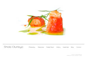
Sometimes I question my attraction to minimalism. When I work it’s usually a battle between my personal appreciation for minimalist design and the reality of a world filled with loud, noisy, look-at-me layouts. Shola Olunloyo

In advertising and marketing, you must get noticed. Get attention. A Call to Action! should shout from the moment a visitor first views the design, or else that visitor will quickly skip on to others. But what grabs the visitor doesn’t need to be a lot. It can be clean simplicity instead.

Most customers want attention-grabbing layouts. Usually I compromise my desired look by adding elements and colors.

In the case of my most recent website design, there was no such compromise, and I’m pleased with the results; the synchronicity of my and my client’s aesthetic.

www.sholaolunloyo.com