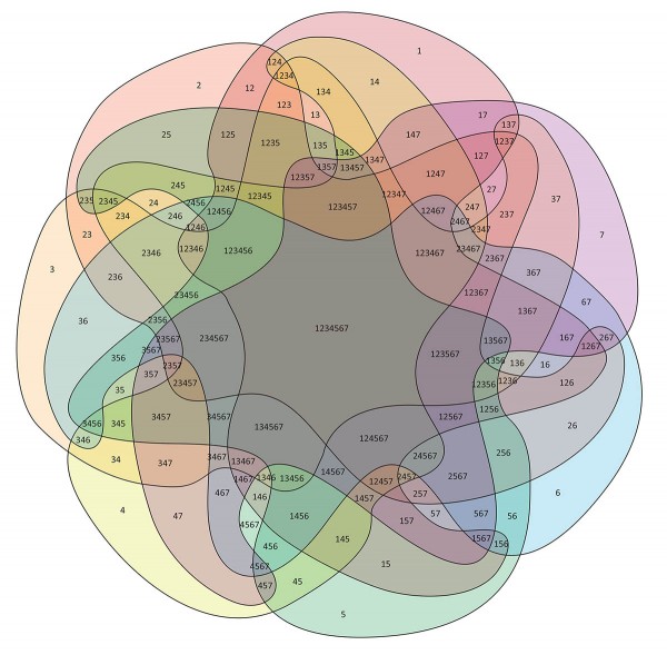
Came across a black and white seven way Venn diagram by way of Information is Beautiful and had the urge to see it in color. Though the numbers provide a hint at all the different overlays of the seven sets, I wanted more differentiation. I decided to created the colorful version in Illustrator. You can download a PDF here.
I set about tracing each of the seven curves. There’s something soothing about drawing Bézier curves — the best use as few points of inflection as possible, and guestimating where each one should be dropped and how far the handles should stretch is happily isolated from anything else in the world. I drew each of the seven shapes before realizing that it was a single shape, rotated seven times.

The shape actually reminds me of the Joozians, from the South Park episode “Cancelled.”
At first I just chose colors for each segment that looked pretty, and set the opacity of each to around 25%. That’s the top image. But to be scientific about it, I realized I should divide the visual spectrum into seven equidistant colors, so in the downloadable PDF, those are the colors used. Each shape should also be 100/7-percent opacity, which is around 14%, but with that much transparency, the outer shapes become too light, boring, almost.
Speaking of boring, adding all of the number strings was not the most interesting task. That part took much longer than tracing the shapes. But it was immensely satisfying — I didn’t let myself add the 1234567 string in the very middle until last.
Are there any practical use cases where you’d need to display seven sets of data in all possible combinations (it turns out to be 127 different groupings)? Perhaps not. It’s fascinating and pretty, though. Wonder who discovered the proper shape.


Thank you for your reply.
I have solved this problem with downloading the specific fonts, as you said, it really doesn’t have matter with fonts, i find the text layer out and do a slightly modify, it looks well~ thank you again!
I may have used a higher version of Illustrator, though I’m not exactly sure at this point. However, that won’t help with fonts — if they’re not on your system, they’re not on your system. That said, it doesn’t really affect the diagram at all; the numbers (the only text) may shift slightly because different fonts are different shapes, but that would be the only difference.
Which version of illustrator (Adobe Illustrator) did you use for drawing this 7-sets veen diagram? when I open the PDF file download from your website with AI CS6, it shows lacking of some fonts in my system. I guess this may be caused by the different version of AI. Did you have any suggestions?
Best,
kid.