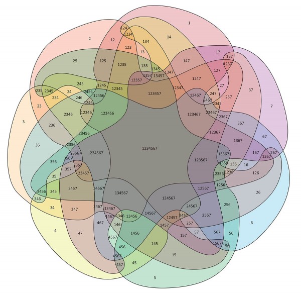
Came across a black and white seven way Venn diagram by way of Information is Beautiful and had the urge to see it in color. Though the numbers provide a hint at all the different overlays of the seven sets, I wanted more differentiation. I decided to created the colorful version in Illustrator. You can download a PDF here.
Category: visualization
The Art of Data

Nick Hardeman is an MFA Design & Technology student at Parsons in New York City.
He has created some surprisingly fantastic bauhaus art from data visualizations of the 1997 music video “Mo Money Mo Problems” from the Notorious B.I.G. album, Life After Death.
From Nick’s blog:
“The algorithm detects edges in the image and attempts to trace motion from frame to frame, using the initial frame as their starting point. … The bright colored track suits worn by Puff Daddy and Mase in the dark backgrounds make for good tracking and nice color combinations.”
Check the Flickr set of several of his renders for more colorful abstract enjoyment.
A recent “quick demo” created for a class is also quite attractive and interesting: he maps the newswire of the New York Times over the course of 24 hours by category.
This Flash/Papervision interactive web app shows what news is posted at each time of the day, giving some insight into the minds of the influential NYT web editors, if not the web news audience in general. Fun to play with.
The school can likely take a bit of the credit. Founded in 1896, Parsons was the first college to offer programs in Fashion Design, Interior Design and Advertising and Graphic Design.
This was thanks to Frank Alvah Parsons, a co-founder who became the school’s president. Anticipating a new wave of the Industrial Revolution, Parsons predicted that art and design would soon be inexorably linked to the engines of industry.
A recent Harvard Business blog post, entitled “MFA is the New MBA,” lends credence to this view, and shows it becoming more & more accepted.
Creativitiy -> Innovation -> Success.
[Via Visual Complexity]
Key Stone
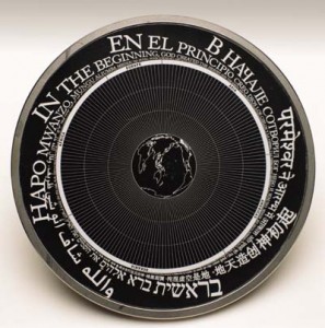
 The Rosetta Project and the Long Now Foundation are building an archive of all documented human languages.
Founded in 2000 — or 02000, as they like to write, the project published their first edition Rosetta Disk in 2008.
The disk holds 1500 languages from around the world.
Made of double-sided micro-etched nickel, the disk is a visual archive, not a digital one. Not format-dependent; all one needs to read the disk is magnification. Like microfiche, but with much more density.
One side of the disk is a guide to the main archive on the reverse. It is etched with a central image of the earth and a message written in 8 major languages:
Languages of the World: This is an archive of over 1,500 human languages assembled in the year 02008 C.E. Magnify 1,000 times to find over 13,000 pages of language documentation.
The message is printed in concentric spirals, both maximizing the number of people who will be able to read something immediately upon picking up the disk, as well as implying how to use it – magnify to see more.
The Origin of the Origin of the Species
Ben Fry is a master of computational information design — of visualizing data.
Humans are very visually oriented.
Organizing information into a well-designed schematic allows us to digest huge amounts of information, and can reveal otherwise unseen connections or structures.
This is a relatively new but exploding field. The New York Times has a great team who regularly create fantastic visualizations to accompany and elucidate articles, and even has a visualization lab, where users can access ready-made data sets and design and submit their own.
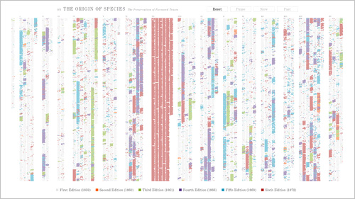
Here, Fry has created an interactive visualization of the changes between Charles Darwin’s six editions of On the Origin of the Species, his famous manifesto on the theory of evolution.
Starting from the first edition, changes are animated into existence, differentiated by color. By the end of the final edition, the resulting image looks almost like abstract art, in the vein of Mondrian.
But this is information design, and rolling over any part of the illegible multi-colored columns will highlight and enlarge the text, allowing the user to read through it, and view the actual changes.
The data is sourced from the Complete Work of Charles Darwin Online, an impressive body of his publications, all digitized by Dr. John van Wyhe & team.
It’s an exciting time in data modeling, and in thought design.

