Ben Fry is a master of computational information design — of visualizing data.
Humans are very visually oriented.
Organizing information into a well-designed schematic allows us to digest huge amounts of information, and can reveal otherwise unseen connections or structures.
This is a relatively new but exploding field. The New York Times has a great team who regularly create fantastic visualizations to accompany and elucidate articles, and even has a visualization lab, where users can access ready-made data sets and design and submit their own.
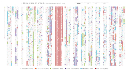
Here, Fry has created an interactive visualization of the changes between Charles Darwin’s six editions of On the Origin of the Species, his famous manifesto on the theory of evolution.
Starting from the first edition, changes are animated into existence, differentiated by color. By the end of the final edition, the resulting image looks almost like abstract art, in the vein of Mondrian.
But this is information design, and rolling over any part of the illegible multi-colored columns will highlight and enlarge the text, allowing the user to read through it, and view the actual changes.
The data is sourced from the Complete Work of Charles Darwin Online, an impressive body of his publications, all digitized by Dr. John van Wyhe & team.
It’s an exciting time in data modeling, and in thought design.
