 Proofreading is important in print design, and that means more than running spell check. The omnipresence of auto spell check has allowed designers to become much more lazy on this point.
Instead it should make them more vigilant (note to self!), because this reliance makes it easier for other kinds of errors to make it into final products.
For example, grammatical inaccuracies. Or simply typing “cat” instead of “can”. Or using the wrong version of a homonym.
Fixing those that do slip by can look almost as silly as the mistake in the first place.
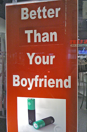
For example, this sign in a shop on South Street has a word cut out of it and replaced. It immediately caught my eye — I was just walking past, rather quickly, when I saw it (okay, okay, I admit, I shop there everyday… ;).
It looks silly, and makes the whole shop look kind of second-rate, which it’s not (it’s actually a rather fancy “erotica shop”).
My husband speculated that maybe this was part of a marketing campaign, a sign with a changeable tag line. We pondered what other slogans could be featured:
“Better LEAVE Your Boyfriend”
“Better WANT Your Boyfriend”
“Better KILL Your Boyfriend”
None of which seemed as likely as the mixup of then/than making it all the way to the final printed poster.