 Form following function is a concept that I first grasped in Biology class. Specifically I think the first example of this that really drove the point home was the design of our lungs: all the bronchi and bronchioles branching off to create the maximum surface area to transfer oxygen to our blood.
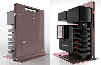
In design it’s a strong concept. One I like to follow. In this new “gaming computer” tower by BMW Designworks Group for Thermaltake it really works. From the designers:
Each high-quality component featured by the “Level 10” concept is enclosed within its own protective case, rendering it not only an integral part of the design but also guaranteeing interchangeability and transportability.
The concept also has an aesthetical answer to the physical necessity for best possible cooling, this also being associated with the virtual world of the gamer. The asymmetric arrangement of the robust vertical heatsink and the horizontally located individual components creates a strong architectural statement, clearly revealing the powerful cooling characteristics of the Thermaltake Gaming Tower.
Usually our workstations end up with the cover off, for better cooling, so they look like this anyway, only not nearly as pretty. Via Core 77.
 Guess a clever and cost-concious person at the Philadelphia Streets Dept. thought up this re-use of the common “No Parking — Street Work” sign. It’s cute.