Rainbow Expo

kibisi logo
It’s widely recognized that Scandinavians have got something going when it comes to industrial design. (Most commonly known example: Ikea)

Three top Danish design firms have recently merged, forming KiBiSi, whose logo itself is a statement in functional modernism.

One of their first collaborations is the wonderfully happy EXPO Chair.

EXPO ChairThese are the chairs that will be placed in the Denmark Pavilion at the Shanghai Expo 2010.

This year’s World Expo in Shanghai has the tagline Better City, Better Life and is “just like an arena and stage for countries and international organizations worldwide to show their originalities and wits.”
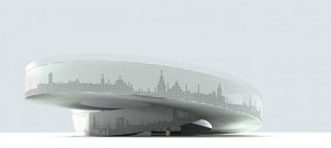
expo danish pavilionThe Danish Pavilion will be a Möbius-strip-like perpetual loop through which visitors can ride one of the free provided bicycles and get a feel for Danish life. In the center is a swimming pool filled with fresh water from Copenhagen, and topped off by their national monument “Little Mermaid” statue (that of Hans Christian Anderson — and subsequently, Walt Disney — fame).

With the colorful EXPO Chairs lining the way, it’s bound to be a cheerful ride.

[Via Core77]
In Living Color

What have all tiles been missing up to this point? Change. Most tiles, however beautiful, are static. Still. They are what they are.

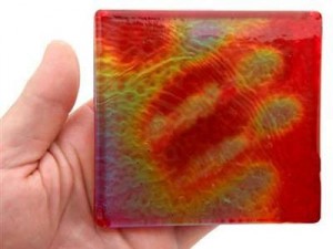
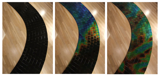
Not any more. Moving Color offers up several lines of temperature-sensitive glass tiles.

moving-color-path

Using anywhere between 20 – 80% recycled materials, this patent-pending product is offered in a multitude of styles and base colors.

moving-color-handEach tile changes color with the temperature, either ambient or via the touch of a human or of water.

The tiles can be carefully customized, with colors or patterns, so design opportunities abound.  Bob Tonjes uses them to create “paintings” that change throughout the day.

From refined to organic to psychedelic, these chromatic slabs can be applied indoors or out.

At $29 per tile, they are not for everywhere, but can be well-placed as accents on fireplaces, outdoor tables, showers and more.

To really get a better idea of the changing beauty of these installations be sure to check out some of the flash animations on the company website.

moving-color-bowl

[Via Gajitz by way of @phi162]

Yikes!

The first mini-farthing bicycle has made its way to market.

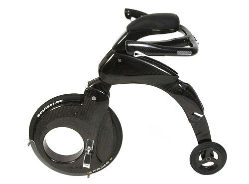
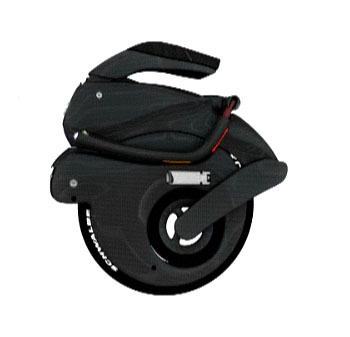
The YikeBike is an electronic powered transportation device that folds up to fit in a backpack.

yikebike1

Weighing less than 22lbs (10kg), it’s designed to go wherever bicycles do, plus some. Fold it, pick it up and hop on a bus, or even into a taxi.

YikeBikes can handle short curbs and bumps and have a tight turning radius.

yikebike3You sit upright, and grasp the handlebars by your sides, instead of leaning forward.

Combined with the anti-skid brakes and speed that is electronically restricted to around 12mph (20kph), YikeBikes claims this makes for a much safer ride.

None have shipped yet, though you can put down a €100 deposit to reserve one. When production nears, you’ll learn the full price, estimated to be between €3,500-€3,900 ($5-6,000).

Overall design is based on the penny-farthings, the Victorian hi-wheels that were the first actually efficient bicycles.

The YikeBike is motor-powered only, but the New Zealand-based company is looking for others to license designs to create a pedal-assist version, as well as a small size meant for kids.

They also postulate about future mini-farthing highways: light suspended roadways traversing a city; a kind of private public transit system, where the bikes could be freed to go much faster.

Hey, it’s good to dream. All in all, sounds better and more flexible than the Segway, and much better than Mr. Garrison’s IT.

[Via print edition of Time Magazine. I knew print was good for something.]

Quick, Call 9-1-1

311logomed1
Because this logo needs serious help.

Or really, it needs to be put out of its misery.

The idea of a 3-1-1 non-emergency call center was pioneered in Baltimore in 1996. Chicago took it a step further in 1999.

New York City’s is the largest, and it has been quite successful since starting up in 2003.

Philly’s fledgling project, which was launched Dec 31, 2008, has been received with mixed results.

The program is without a doubt a step in the right direction.

Philly311 is on twitter, is set to receive their millionth call, and even monitors the neighborhood citizens’ reporting site SeeClickFix.

However, in August the hours were cut back from 24/7 to business hours only.

Public perception will play a large role in the future growth and funding of the program. Design is key in this regard.

logo_311_NYC This logo does not help. It is overly complex. It looks like many other company logos, without really being as nice as any I can think of. It is not an easily recognizable shape.

And mostly, this logo does not convey easy access to information and help. Much the opposite: the unbalanced colors and shapes suggest a frenzied, harried, mess.

NYC even has a whole set of different logos and posters available for download based on their clear, straightforward logo.

Anyone in Philly Gov have authority to hire a logo designer? 😉

Sticks & Twigs

canapes
But not the kind that only vegetarians eat.

Foodplayerlinda has made a design breakthrough in hors d’oeuvre-ature.

She was inspired to ignore the leaves piling up in her yard.

Instead, she developed a new method for creating and presenting “cheese and crackers.”

Read the story here. Recipe included!

Old-Timer

LED Pocketwatch
If only technological advances always meshed this well with honored traditions.

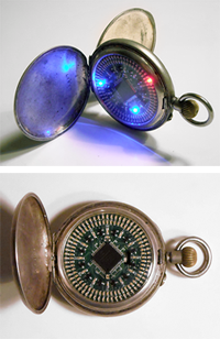
Paul Pounds took his grandfather’s 1925 Elgin pocketwatch and converted it into a fully functional digital timepiece.

The time is not displayed as cyphers, however.

The face is a beautifully designed set of LEDs that mimic analog clock hands with concentric circles of light.

Gorgeous not only in looks, but also in user interface, the watch boasts an audible “tick” for each second, easy time-setting via the stem, and a custom alarm.

After 15 seconds, the watch goes into standby mode to save batteries.

When you open the face, it lights up again.

At each minute interval, it sets off a swirl of LED color!

Some additional deets: Paul wrote the program in C (and fit it in a 2KB code-size limit), used 133 surface mount LEDs, and engraved a tiger eye under the micro-chip.

Beautiful.

[h/t @bre]

To Slick or Not Too Slick?

A client recently paid for an advertorial (“special advertising section”) in a national publication.

Included with the placement price was design & layout of the 4 page piece.

The idea was — as it usually is with these segments — for the in-house art department to use our photos and logos to create a layout that was in-line rest of the magazine, so that readers would not simply skip over the section on their way to the next article.

However, when the proof came back, my clients hated it. And I had to agree.

It looked… mostly… blah.

golfweek_sm

Whether or not it looked like an article in the rest of the magazine (and I don’t believe it did — I’m not convinced it wasn’t thrown together by a first-year college intern), it was lacking in design.

It did not intrigue, fascinate or sell!

Although the final art deadline was within 24 hours, I volunteered to redesign the piece.

Clients = happy.

In other words: advertising should be slick.