Slow Cow

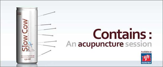
Hailing from Quebec, the anti-energy drink Slow Cow.

A new take on the enhanced beverage market, the drink relies on L-Theanine, Camomile and Hops, among other ingredients, to impart relaxation and calm.

Slow Cow

Red Bull is none too happy with this inverse clone, and has sent the company a formal request to close, on grounds of packaging and design infringements.

Are they really worried fans of their high-octane swill will switch to this soothing alternative? Or maybe just feel that they are being ridiculed. (They are…)

slow cow logoThe logo is brilliant (wish I could find a larger version). It deserves a wider audience.

Along with the Fail Whale, we should have the Slow Cow!

[Via @mjginnyc and Daily Fork]

Freestylin’

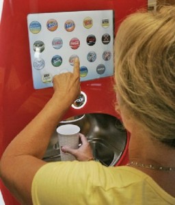
Coke Freestyle In UseThe soda fountain hasn’t changed much in basic design since it was first popularized and democratized in the late 1800’s by Jacob Baur, founder of the Liquid Carbonic Company, whose main contribution was the manufacture of carbon dioxide in easy to transport tanks.

At today’s dispensers, usually found in restaurants, you can choose from around six or eight different types of soft drinks.

In the Taste It room at the World of Coca-Cola in Atlanta, you can choose from 60 different kinds, which are dispensed from six separate cylindrical kiosks, taking up a whole room of the venue.

But now, starting in a few select Jack-in-the-Boxes (Jacks-in-the-Box?) in San Diego County, Coca-Cola is rolling out what they have dubbed the “iPod of drink machines.”

The Coca-Cola Freestyle lets the user select from over 100 varieties of soft drink from a touch screen.

This was enabled by rethinking the internal design of the dispenser, which uses small cartridges of concentrated flavor instead of bags of syrup.

Vince Voron, the senior director of industrial design at Coke, was recruited from Apple, so the comparison to iPod is more than fair. He notes that one of the challenges in designing the user interface was to make it friendly and not reminiscent of an ATM.
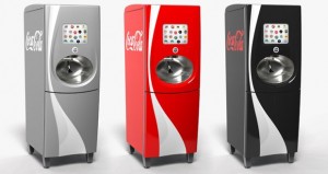
Coke Freestyle MachinesFast Company details some of the technology behind the machine: the “PurePour” used to mix in the flavors was originally developed for precise delivery of dialysis and cancer drugs; cartridges are kept in order using RFID radio frequency tags.

And in what should be good news for shop-owners and Coca-Cola alike, each Freestyler wirelessly communicates with HQ, sending info about what was consumed, when, how much, and receiving info about products that should be recalled or discontinued. (Guess with 100 flavors that’s more & more possible.)

Test markets this summer are said to include California, Utah and Georgia. Reason enough for a trip down South?

[via San Diego Tribune and Core 77]

Drawing on the Refrigerator

Kudos to Marjorie Amrom!drawing on the fridge

Last December the Philadelphia Streets Dept. ripped up the sidewalk corners in much of the Wash West/Society Hill area, one block at a time.

New signal boxes were erected and cast into the concrete, in anticipation of an (ongoing?) $12 million project to deploy digitized traffic signals throughout the city.

Because of a Federal DHS mandate to include future surveillance equipment along with the lighting equipment, the new signal boxes are huge, probably 3-4 times the size of the previous, pole-mounted ones.

As the Inquirer’s Inga Saffron points out with her usual acumen, these empty boxes look like huge brown refrigerators, and are an urban design nightmare in our neighborhoods of rowhouses.

On her blog she highlighted a few of the more egregiously placed metal monoliths, and noted that the flat sides were an empty slate almost begging for graffiti.

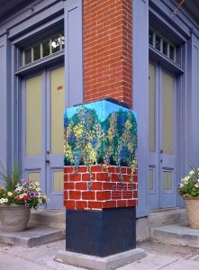
A prime example was this one, smack up against the historic house owned by Marjorie Amrom.

It appears that Amrom’s gone and had an artist paint a very attractive and colorful trompe l’oeil, or mini mural, all over the offending box.

Can we get the Mural Arts Program to commission a project to paint the rest?

UPDATE: Inga Saffron wrote another follow-up post, highlighting this box. She mentions that it might be “going a little too far” to paint all of the signal boxes like this. And a commenter points out that getting neighborhoods to agree on a design might “take as long as fixing the city budget.”

I still think it’s worth a try.

Oops

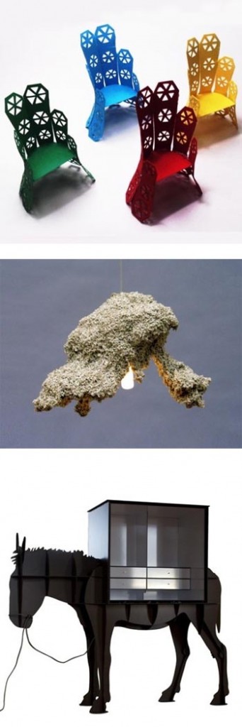
ugliest and silliestCourtesy of Andrej Statskij design studio in Latvia come the Oops Awards for bad product design.

In the search for new and original design ideas and executions, there have to be many misses.

Though many are relegated to design-showroom-only status, and never make it past prototyping, it’s fun to take a look at what we hope doesn’t appear in stores or homes.

The anonymous Oops Design Award Foundation began giving awards in 2008 for Ugliest, Silliest and Most Useless Product Design.

They have selected nominees for 2009.

One of the interesting concepts this award highlights is that bad and good design can be very subjective.

For example, as Core 77 notes, one of the chairs nominated for the 2009 Ugliest category has already won the Cicely & Colin Rigg Contemporary Design Award, which is totally serious and comes with a $30,000 prize.

Somewhat related, and definitely in my Oops category, is this house which is currently on the market for $4 million (recently slashed from $5.5 mil).

Comments on the hideous “live-in” scuplture ranged from “That just made my eyes throw up” to “Dr. Seuss on acid.”

But someone is bound to buy it, because it’s different.

Much like the apparel that shows up on the catwalk during fashion weeks around the world, these designs are pushing the edge of what we recognize as attractive, in the name of innovation.

I suppose looking at what’s bad helps us define what’s good.

Without rainy days, who would as much appreciate the sunny ones?

Social Interaction

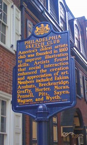
phila sketch clubI previously mentioned the Philadelphia Sketch Club, founded in 1860 by some famous Philadelphia artists on Camac Avenue (that of the wooden cobblestones).

Don’t think I ever read the historical sign that is currently posted in the Avenue, though. These signs, erected by the Pennsylvania Historical and Museum Commission since 1946, are studies in idea condensation.

Way before Twitter, the designers for these signs did a pretty great job compressing history, philosophy, biography and more into signs that measure approximately 1ft x 2ft and hold less than 250 characters.

This one holds a gem of a sentence. One that deserves more publicity than it’s small alleyway allows.

Artists found that social interaction enhanced the creation and appreciation of art.

Still does. Still does. Still going strong.